Since the dawn of the very first album, album covers have been an important tool in conveying the very essence of a musical project in just one single image. Over the years, artists have experimented with the form of album covers in a varying amount of ways, from holographic covers to moving pieces of artwork.
Despite all of these adventurous experimentations within music, the most striking departure from the norm was the wordless album cover, a movement which became popular in the late ‘60s and which today in the 2020s is now an essential element of an album's success. We take a look at the history of the wordless album cover, from the revolutionary artwork of Abbey Road to the striking images that front some of the most successful albums today.
Flashback to the ‘50s, where albums were simple and usually without theme or concept. Covers would be littered with words, oftentimes naming the hot singles that would be tucked away in the projects tracklist. Two things were almost guaranteed on an album cover – the name of the artist, and the name of the album.
After all, how would you know what you were buying without these two vital pieces of information? Take Elvis Presley’s self-titled album released in 1956 as a prime example of the worded cover format.

Books have stuck to this formula since the very beginning, and continue to do so to this day without fail, so when did albums steer clear from this pretty solid structure? Well, to answer this question we must move forward to the late ‘60s and early ‘70s, where two bands acted upon their overwhelming popularity and went completely wordless, allowing the music to speak for them. (Spoiler: it was incredibly successful.)
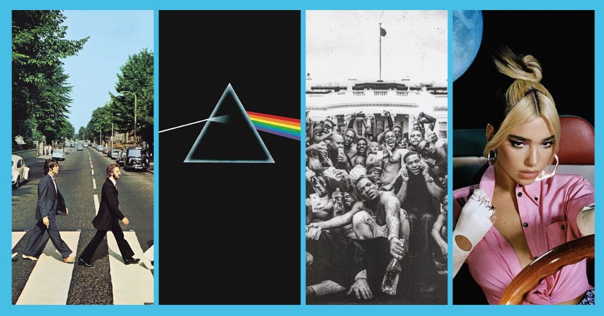
The Beatles, to no surprise, were one of the first bands to popularise the wordless album cover with their 1969 album Abbey Road. The image was a simple photograph that captured the fashion and attitude of the time, while also being instantly iconic in its simplicity. Not a word graced the cover, because at this point in time, everyone knew who The Beatles were. Instead of cluttering the space with typography, the band opted for a simpler approach, to massive success.
While this was in September of 1969, Led Zeppelin would soon follow in November 1971, with the cover to their similarly iconic album IV. Widely considered to be one of the band's best projects, the album cover for IV was but a simple murky photograph, which allowed the viewer to treat it like an actual artwork presented in a gallery. Iconic art was also implemented by King Crimson for their 1969 album In The Court Of The Crimson King, which cannot be forgotten in a discussion about album covers.
Thus birthed two movements in a close timeframe, the simple wordless photograph, and the simple wordless picture, which would carry over to the following years, ushering in some of the most iconic album covers the world has ever seen.

The ‘70s was a welcome field for all kinds of new explorations in music, and it was also the place of origin of two of the most immediately identifiable wordless album covers in music history. Pink Floyd’s Dark Side Of The Moon (1973) has had its album art plastered over shirts, stickers, hats and bumper stickers, all because of its simplicity in design and immediacy in colour scheme.
This cover in particular was simple to the point of genius, pointing towards the project’s psychedelic themes, and actually bolstering the music within the album itself, and was designed by Storm Thorgerson.
Following this album in 1979 was Joy Division’s Unknown Pleasures, which has similarly been graced on many a t-shirt across the globe. Much like Dark Side Of The Moon, this dark and brooding project utilised the power of simple design to form a striking image that would stick with the listener.
Both images were instantly memorable, and both were true to the nature of their albums. For the first time in music, design without words was shown to be enough to carry an entire project on its shoulders.

Following these albums came a slew of other iconic wordless projects over the next two decades, such as Prince's Lovesexy (1988), Kylie Minogue’s Impossible Princess (1997), Neutral Milk Hotel’s mysterious and often-analysed In The Aeroplane Over The Sea (1998) and Yeah Yeah Yeah’s It’s Blitz (2009), to name a few.
This brings us up to the 2010s, where album art became more acceptably wordless, and projects that adopted this strategy often became associated with being incredible albums. Katy Perry introduced the pop world to simple evocative imagery with her highly praised 2010’s project Teenage Dream, a conceptual cover that gave the viewer an instant taste into the sugary sweet jams that lay inside, and Kendrick Lamar crafted one of the most important and powerful images for his 2015 opus To Pimp A Butterfly.
The wordless album cover was no longer an artistic choice, but a medium with a message. Concepts were starting to become more prominent within the sphere of albums, and artwork became the means to tie everything together.

In recent years, artists have done this to great effect. Lizzo bared all on the cover to her personal and exuberant 2019 project Cuz I Love You and Stormzy presented a macabre and sombre image for his incredible album Heavy Is The Head, an album title which would make little sense without the cover to finish the sentence (that wears the crown).
Just this year, Dua Lipa impressed music lovers across the spectrum with her immediate and energetic disco pop album Future Nostalgia, which possessed one of the most powerfully vivid album covers of the year. By being wordless, such an album was able to allow the music and the artwork to speak alone, while simultaneously speaking in unison.
Wordless album covers have become the way of the future, despite starting off as deviations to the norm. No longer are albums considered collections of songs from a well-known artist, but conceptual pieces of work with abstract themes and important messages. Over time, albums have been able to become works of art in themselves, and just like the Mona Lisa, no words are necessary.


